- The ideal YouTube banner size in 2026 is 2,560 x 1,440 pixels. This is confirmed as YouTube's recommended size, unchanged from previous years. Your file must be under 6 MB and in JPG, PNG, GIF (non-animated), or BMP format.
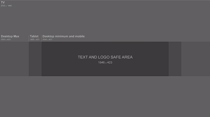
- The safe area is 1,546 x 423 pixels — and it matters more than ever. Over 70% of YouTube traffic now comes from mobile, meaning the safe area is the only part of your banner guaranteed to display on all devices. Keep all logos, text, and key visuals inside this central zone.
- Design from mobile outward. Mobile shows the smallest area (1,546 x 423 px), while TV displays the full 2,560 x 1,440 px image. Place critical elements in the center, and use the outer space for background visuals and gradients that enhance the look on larger screens.
Your YouTube banner is your first impression. It's what first sets clear expectations for your channel. But for this to happen, you need to be clear on what you’re about and what your YouTube content will cover.
To this end, it’s vital that your banner is of the perfect dimensions — so that it doesn’t get cropped out. But what size is a YouTube banner, anyway?
As of 2023, the ideal YouTube banner size is 2560 x 1440 pixels. However, there’s a lot more to it than that, so we highly suggest that you read on.
Jump to a section:
- What’s the best YouTube Banner Size?
- What Does ‘Minimum Image Safe Area’ Mean and Why is it Important?
- How Do You Change Your YouTube Banner?
- YouTube Banner Examples and Best Practices
[#TOC1]What’s the Best YouTube Banner Size?[#TOC1]
Here’s what you need to know about YouTube channel art dimensions:
A few guides are recommending a 1024 x 576 image size for YouTube banners. But that info is outdated. 2,560 x 1,440 pixels is currently the way to go. This is the optimal YouTube banner size for all types of screen sizes.
But this isn’t all there is to it. There’s a lot more to YouTube banners than their recommended sizes.
For your YouTube banner to be approved, it must remain under the 6 MB maximum file size, with a platform-accepted file format—JPG, JPEG, PNG, GIF, or BMP. The same goes for your profile picture. Avoid the minimum image dimensions and opt for the recommended banner size to avoid having a blurry or pixelated image on larger devices. You want your banner to be high-resolution at all times.
Luckily, free image format converters like Convertio, and image compressors like Img2Go can adjust an existing file in the wrong format or with a larger file size. These converters make the files viewable and do stuff like converting videos to GIF.
[#TOC2]What Does ‘Minimum Image Safe Area’ Mean and Why is it Important?[#TOC2]
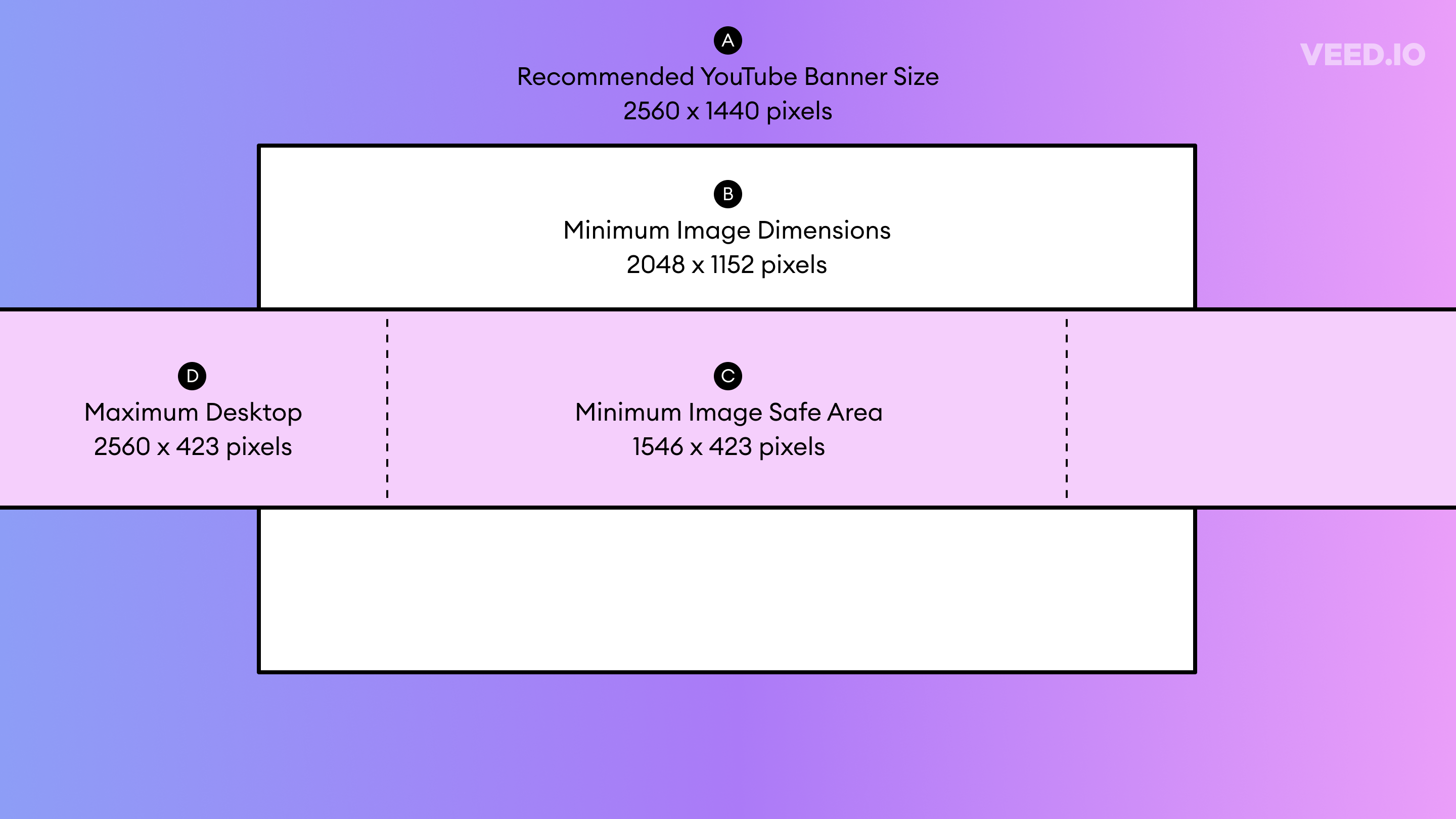
Minimum Image Safe Area — or simply “safe area” — is the minimum area where your banner is viewed optimally. This is the section of your YouTube banner that is visible across all devices, including desktop, mobile, and TV. It’s therefore crucial that you include all the essential elements on your YouTube banner, such as your logo, image, any text, etc., within this safe area.
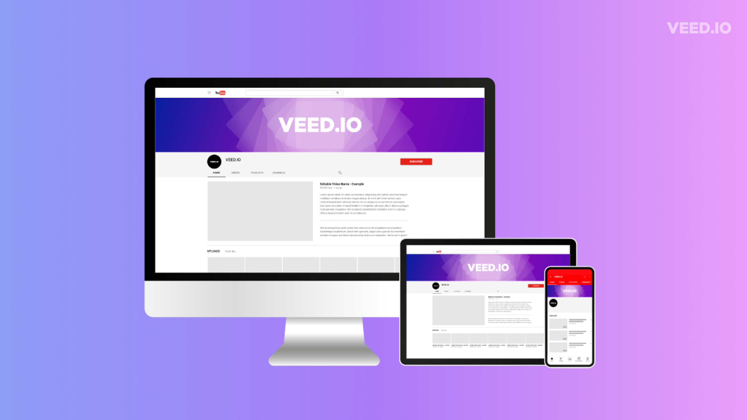
Different devices have different screen sizes, which means your banner will appear differently across them. If you don’t follow the safe area rule, the important elements on your YouTube banner may appear on TV, but they may get cropped out when viewed on a smartphone or a desktop. It’s therefore crucial to design your YouTube banner while keeping the minimum safe area in mind.
Here is a quick guide on the important terms you need to keep in mind:
Don’t have a way to measure pixel by pixel to make sure everything fits?
No problem!
A good rule of thumb is to keep the most important details as close to the middle of your banner as possible. Anything placed on the far right or left or towards the very top or bottom is at risk of being chopped off when viewed on a smaller device.
If you are new to this, don’t be afraid to do trial and error and test it out on a dummy account. See if your design fits the channel banner on all types of devices. If not, head back to the drawing board and edit it. But we assure you, as long as you follow the “safe area” it always works like a charm. Once you get it right, go ahead and upload it.
[#TOC3]How Do You Change Your YouTube Banner?[#TOC3]
- Go to your YouTube channel.
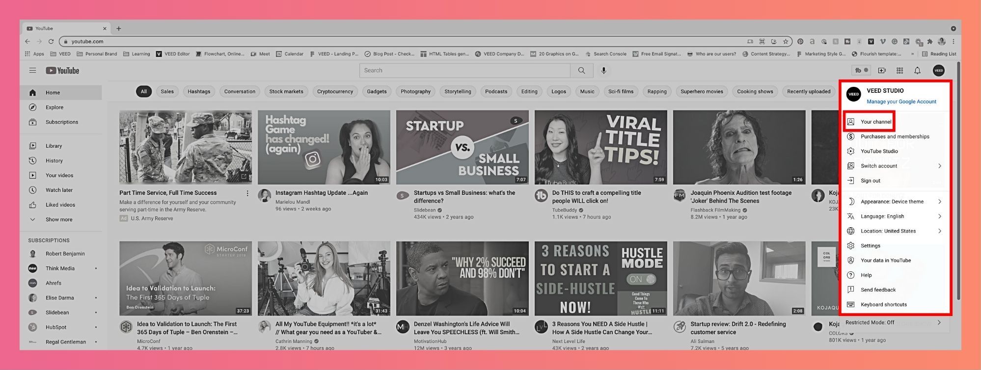
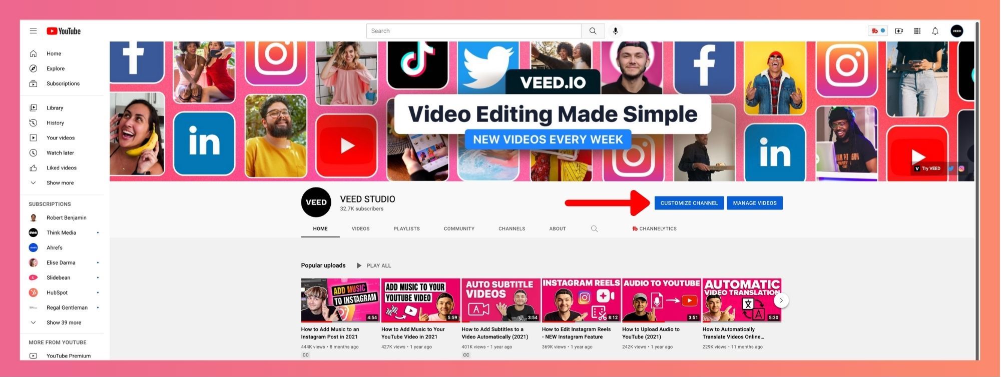
- Click on “customize channel.”
- Go to 'branding' and choose 'banner image'
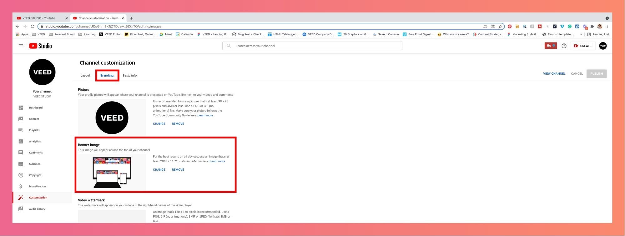
- Click ‘change’ to upload (or drag-and-drop) your banner image.
- Your first indicator of an incorrect file dimension will appear here. If you upload a banner with a size smaller than 2048p x 1152p (minimum YouTube banner size), the platform will ask you to upload another image.
- Once uploaded, check your banner image view across desktop, mobile and television. If you see some part of the image cropped and want to fix it, click on “adjust crop.”
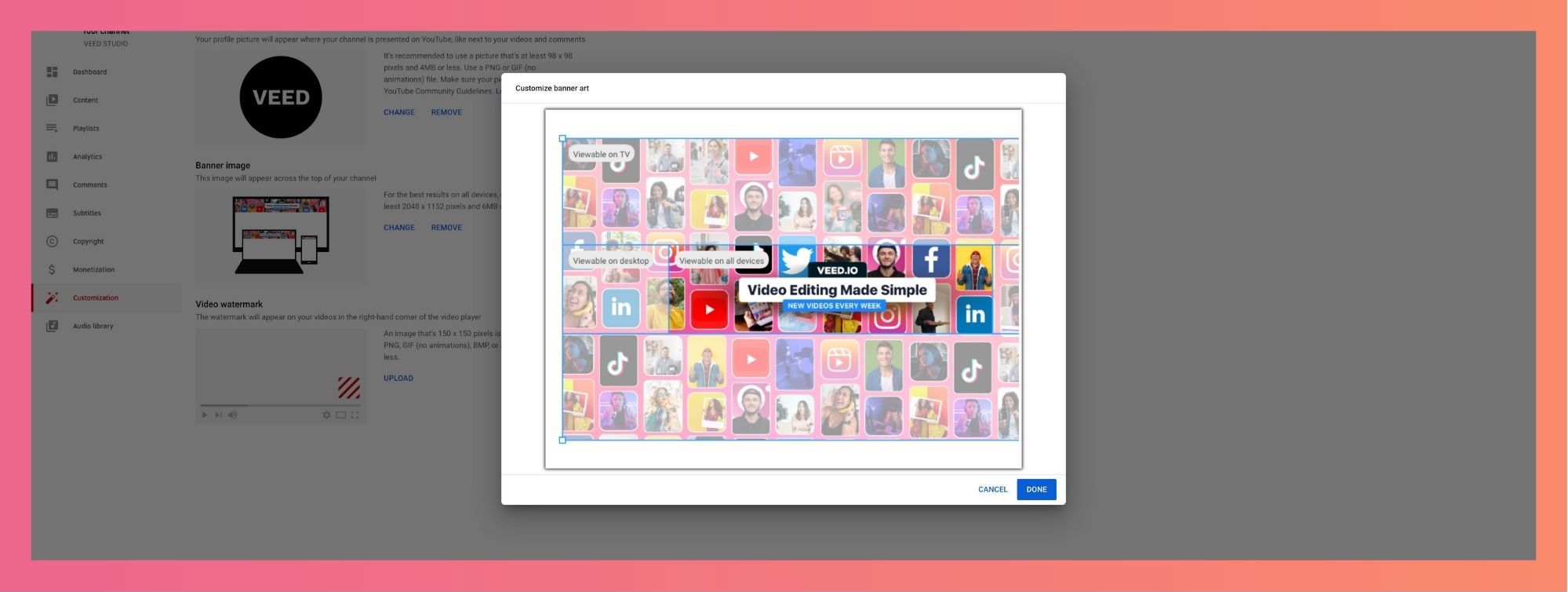
- Click and adjust the highlighted box to fix the banner image, and make it a size-fit.
- Once you’re satisfied, click on “done” to upload the banner image.
.png)
[#TOC4]YouTube Banner Examples and Best Practices[#TOC4]
An eye-catching YouTube banner does a great job at communicating what your brand is about. But most importantly it encourages people with a reason to watch your content.
Here are some best practices for you to avoid this and create a stunning banner that makes people want to watch one of your videos.
1. Add the face(s) of your brand to the banner image. People want to interact with people. Humanize your brand and make yourself more approachable. Show your face or the faces of people involved in your content.

2. Find an innovative way to represent your brand through the banner—make a collage of images symbolic to your brand. This can be things like behind-the-scenes or product images. Alternatively, you can also take a minimalistic approach and use illustrations that help your audience relate to the brand.

3. Consider adding a tagline to your banner—add a crisp one-liner expressing what you post about. This helps visitors understand what you have to offer. And if it resonated with them, you might have a new subscriber! Ahrefs does this best with a simple yet self-explanatory tagline.

4. Add a touch of credibility to your channel by including the logos of magazines or publications you’ve been featured on talks you’ve delivered or the awards you have received. These can make for a subtle plug in your banner but can help build a lot of authority.

5. Optimize the clickable aspects of your channel cover by adding social media and site links in your channel settings. If you have lead magnets you can even use HubSpot's form builder to capture and save leads.

6. Your banner is also a space where you can advertise either your recent projects or your most famous works. This connects your banner to your well-known videos to give viewers an idea of the type of content you aim to create.

7. If you are new to graphic design and creating banners, you can make your job easier by using templates. YouTube banner templates can be found on various websites that have guides in utilizing the safe zone as well — or you can use pre-designed templates in VEED to get started quickly.
Aside from the tips above, here are some general tips that you can apply regardless of what type of banner you are going for:
- Fonts are important. Whether it is a unique font that you made yourself or a font you took from the internet, make sure that it is in line with your concept and the identity of your channel.
- Your channel banner is similar to a YouTube thumbnail. However, instead of introducing a single video, it introduces your entire channel page.
- There is no best banner design. Every banner varies depending on a channel’s identity, so don’t compare your banner with others.
- Explore different design tools, such as Adobe Photoshop, to help you create your own unique banner design while maintaining the YT banner size — then use VEED to add subtitles and captions to the videos your banner represents.
A YouTube Banner is Your Chance to Make a Lasting Impression — Make it Count!
Equipped with endless possibilities only limited by your creativity, your YouTube banner is your best chance to make a good first impression that could bring in more subscribers. However, the aesthetics are only a part of what makes a great banner.
A good banner looks good but isn’t scaled right. A great banner looks amazing and is sized according to the minimum image safe zone to accommodate the various devices that are used to view your channel. With that, no one is left out.
Think of it as a book cover. We all know not to judge a book by its cover, but a well-designed and thought-out cover will catch attention and leave a lasting impression on readers. Similarly, you need to create a presence on YouTube, and one way to do that is through your YouTube banner. Make the most out of it and be sure to let your creativity shine!
Here are some must-reads to help you become an amazing YouTube content creator!
- 105 YouTube Video Ideas Every Creator Needs to Know
- The Best Time to Post on YouTube (according to our research)
- The Best YouTube Video Formats (Ultimate Guide)
- How to Share a YouTube Video on Instagram
- How to Make a YouTube Video to a GIF in Seconds
.png)


