Want more views on your YouTube videos? Create custom YouTube thumbnails. These offer an excellent opportunity to leave a solid, first impression on potential viewers.
However, getting the basics such as the YouTube thumbnail size correct is uber-important.
So in this post, let’s discuss the correct dimensions for YouTube thumbnails. We’ve also got proven YouTube thumbnail design tips from the pros who manage YouTube channels over at Ahrefs, Podia, and VEED.
In the end, you’ll leave with actionable takeaways that you’d be excited to try for yourself.
What’s the best YouTube thumbnail size?
Wondering how big is a YouTube thumbnail? Here’s your cheat sheet:
Stick with the recommended dimensions for YouTube thumbnail and a high-quality picture.
The reason? Even though a thumbnail shows as a small image in search, it’s shown in full when suggested as a next-watch video or when you embed it on your site.
So if you’ve a smaller, poor-quality thumbnail, it’ll blur or pixelate as YouTube expands it to the full video size. It’s why sticking with a larger image size is best. When your original image doesn’t meet these size requirements, using an image upscaler can help increase dimensions while preserving important detail.
Why are YouTube Thumbnails Important?
YouTube thumbnails are video cover images that entice viewers to watch a video by offering them an attention-grabbing look into what’s covered.
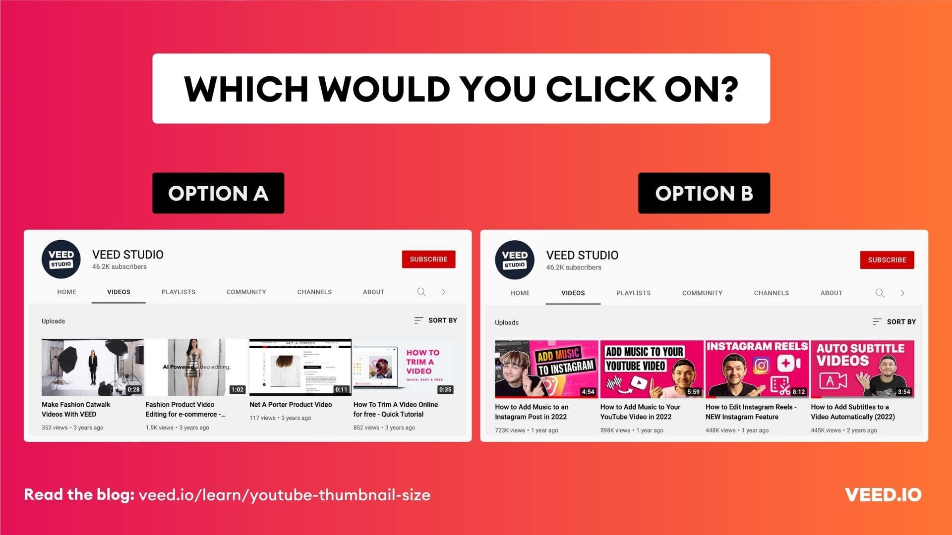
Typically, after you upload a video on YouTube, the platform recommends three stills from the video. You can either choose from them or tell a better, more convincing story by creating a custom YouTube thumbnail.
A custom thumbnail on YouTube isn’t a requirement. But it helps by:
- Giving you a better chance to gain your audience’s attention by sharing branded images that showcase what the video covers.
- Giving you plenty of branding opportunity so viewers gradually become familiar with your brand.
Most of all, you can create a branded look for your channel — consistent with the rest of your marketing channels — by designing on-brand thumbnails for each video that you upload.
Here’s VEED’s YouTube channel, for example:
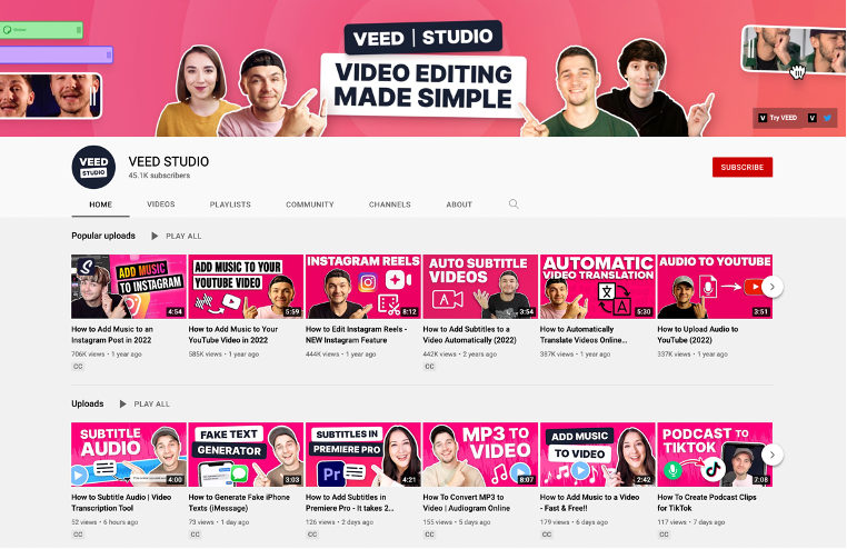
If you’re coming from our blog post, for example, you can instantly tell you’re in the same company. Consistent content experiences are cool after all 🙌
Still debating whether you need custom YouTube thumbnails? Let’s look at some impressively convincing numbers that this study concluded:
- 72% of the most popular YouTube thumbnails include a face — getting an average of 921,000 more views than thumbnails without faces.
- 88% of the most popular thumbnails are colorful and get an average of 617,000 more views than less colorful thumbnails.
That’s not all though.
Our study of 600+ YouTube videos that we curated from the trending section on the platform showed that the best YouTube thumbnails feature:
- The shocked facial expression which is the most common visual cue in thumbnails.
- The big fat arrow which is another common element among trending video thumbnails from various genres.
- The before/after comparison design. Another common design element that shows the side by side comparison that the video covers.

Note that all three of these winning elements draw in viewers by making them curious. Most of all, they make a strong case for creating custom YouTube thumbnails with image effects.
How to Create YouTube Thumbnails
Whether you want to create a custom thumbnail or choose from the frames YouTube pulls up for you, we’ve got you covered.
Let’s look at both the options individually.
How to Make a Custom YouTube Thumbnail
To start off, research the YouTube video idea you’re creating content on.
The aim? Look for visual patterns that turn up in the video engine’s search result as you type in the keyword.
See if there are certain colors that ranking video thumbnails feature, any visuals such as device mockup or social platform icon that show up consistently.
In addition to the design and color, look at the text. Ask yourself: are there any thumbnail text similarities across the top video content?
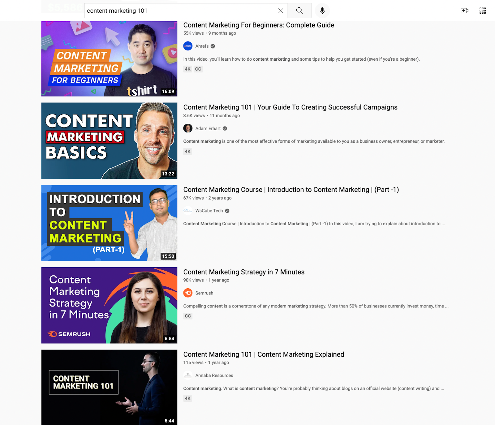
The idea here isn’t to copy the top results. Instead, find the visual cues that are getting people to click and watch those videos.
As for ideas for designing custom YouTube thumbnails, there are a ton of options to explore.
Before you proceed though, you’ll need two tools:
- A DIY YouTube thumbnail creator — we’ve shared our top 3 recommendations below
- Your visual brand identity guidelines including notes on your brand personality. This way, you can create on-point thumbnail images that reflect your brand’s personality.
One more thing: you can always create a YouTube thumbnail template to speed up thumbnail design.
Take it from ConvertKit, for example.
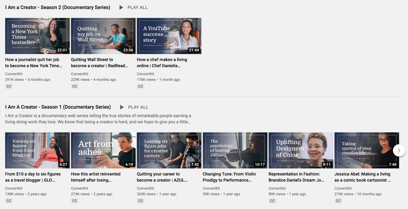
They’ve a thumbnail template with the same borders, text positioning, and shaded blue color. The image in each template thumbnail is different though — showing the creator featured in the video.
This helps the channel not only create a uniform look, but also helps them tell better stories with their personalized images in the template thumbnail.
Now for more ideas of thumbnails to try — you’ve the following options:
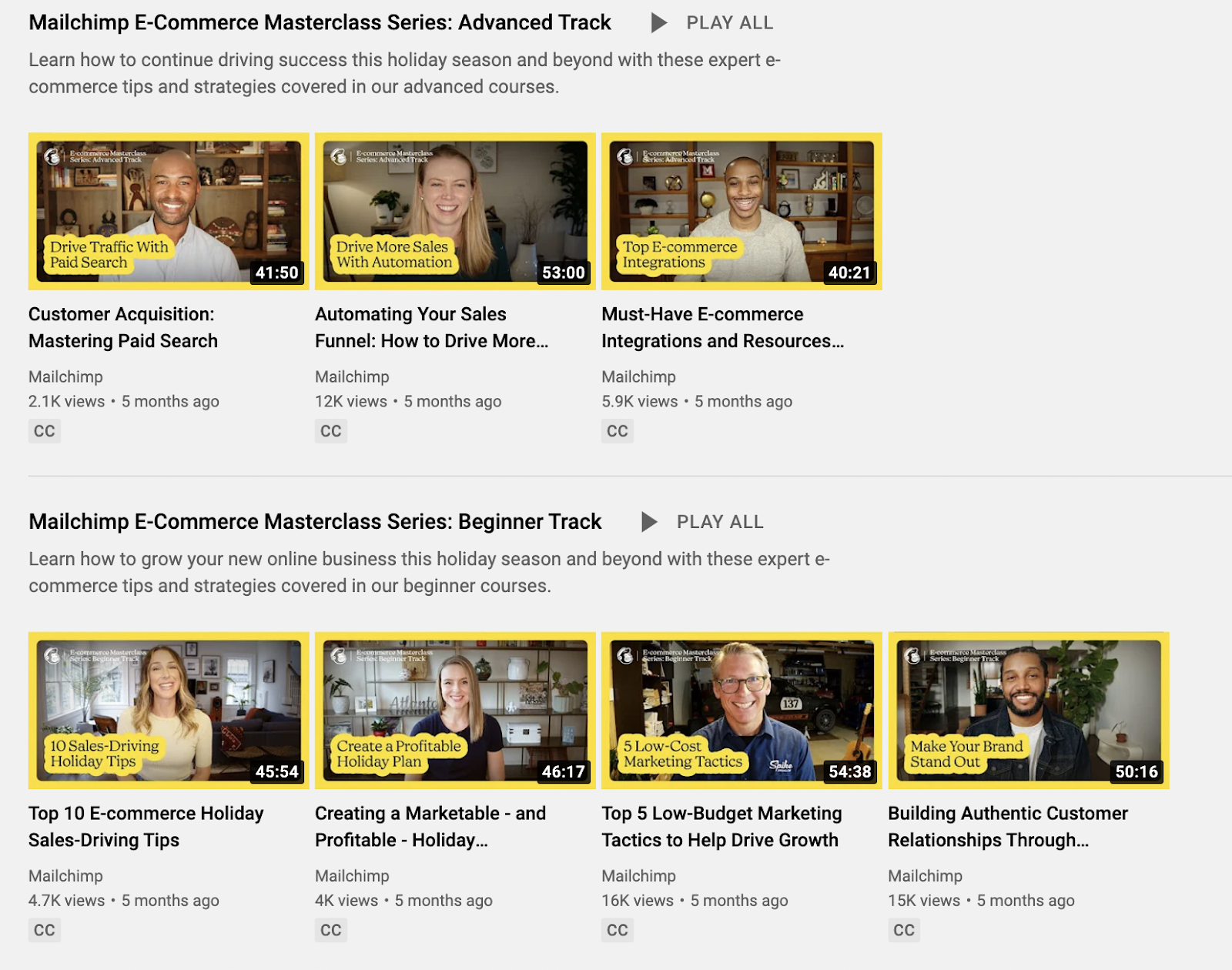
Text overlay with still image
This is pretty straightforward. But you can take an extra step and format the text by adding a background to it as Mailchimp does. This helps you stand out as most people simply add text with a still image.
Logo with still images
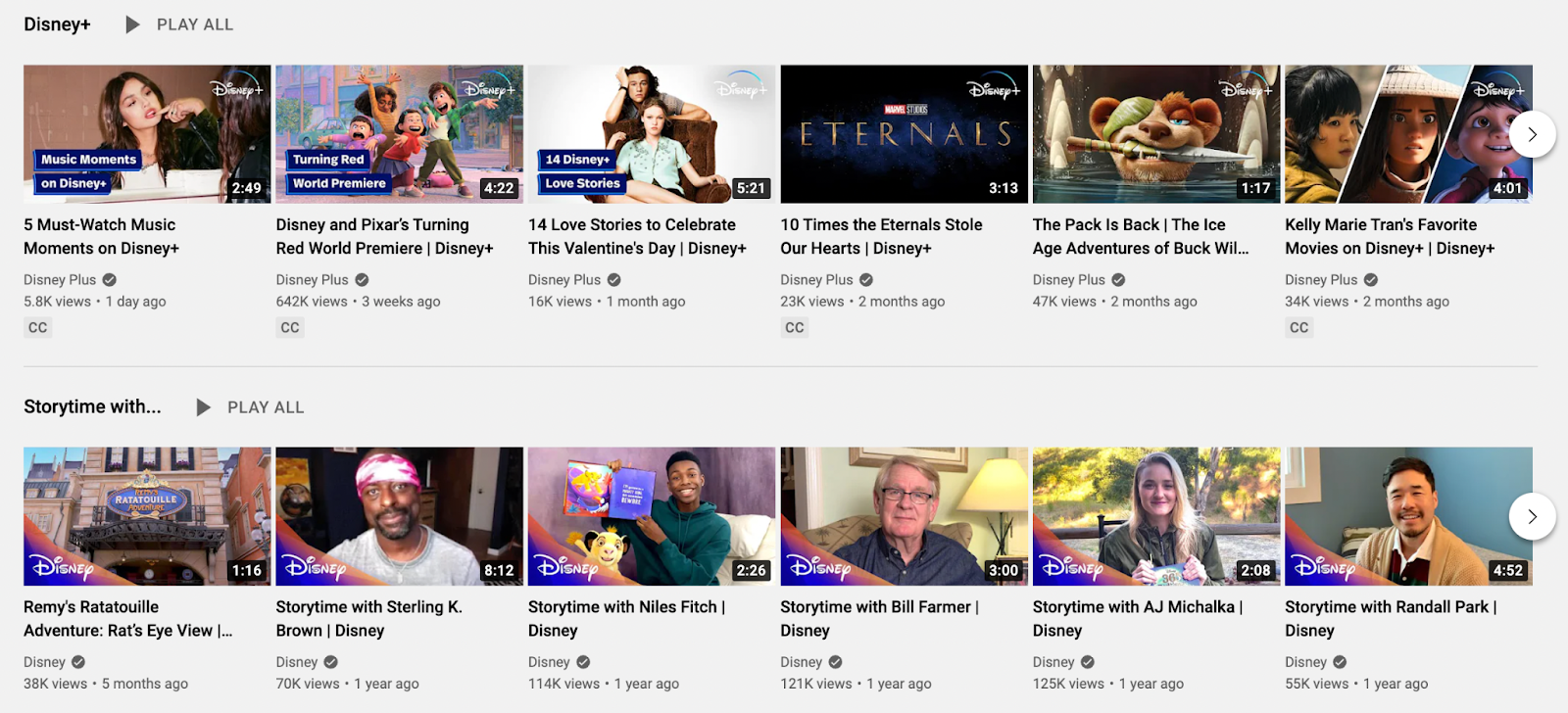
Instead of text, you can also add your logo with an attention-grabbing image from the video. See how Disney+ does this:
Brand mascot with text overlay
Have a prominent brand mascot? Add it to your YouTube thumbnail design as Trello does:

Design assets with text overlay
Another idea is to use a plain background with a design asset and text overlay for clutter-free YouTube thumbnail design. Hootsuite does this best:

Plain design patterns with text overlay
If illustrations and graphic designs don’t align with your visual branding, consider using design patterns as Miro does:

If you’re a SaaS tool, you can also show product screenshots for tutorial video thumbnails.

Text-based thumbnail design
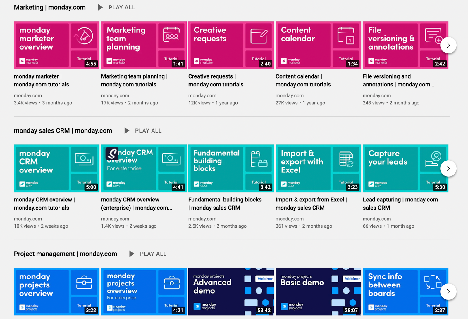
Want to simplify your YouTube thumbnail design even further? Take a page from Monday.com. Its thumbnail images feature its logo, bold text, and icons on a plain background.
Cropped out image with design
And, finally, you can remove your image’s background and add it to a branded template. SproutSocial does this well:

How to Pick a Thumbnail from Your Video Frames
After you upload your video, YouTube auto-generates system thumbnails or a set of three thumbnails that are stills from your video.
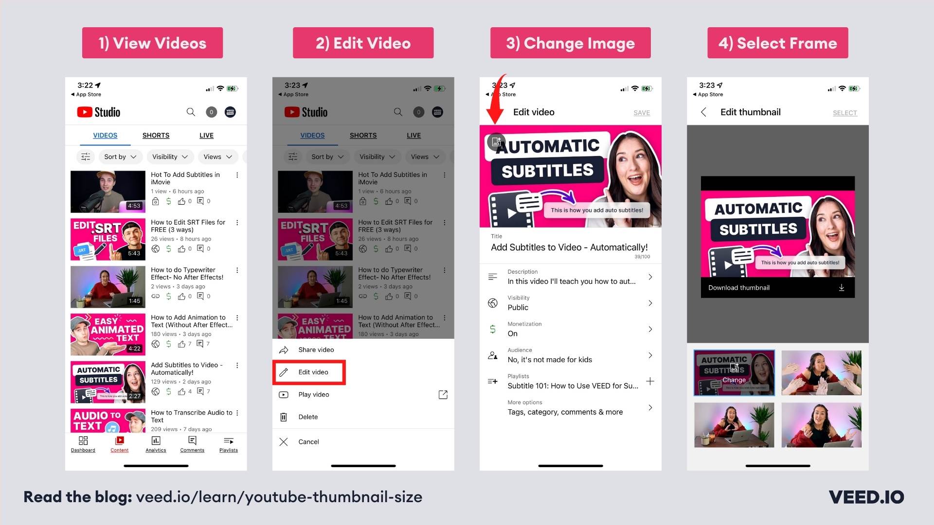
As you upload your video to YouTube Studio, you’ll see the three thumbnail options under your video.
If you’re adding thumbnails to a previously uploaded video, go to the side panel on the left and select Videos. Then choose your video. Next, select the thumbnail option from under Thumbnail.

If you’re using your phone, you can do the same by opening your YouTube Studio app. Then choose the video you want to edit and click the three dots to open the menu and select edit video. after that and select the video you want to edit. Tap the image icon in the upper left-hand corner. You can now choose from the available thumbnails.
3 Best Tools to Create YouTube Thumbnails
Now for the YouTube thumbnail maker recommendations we promised:
1. Canva
Best for: Marketers looking for an easy to use DIY YouTube thumbnail maker.
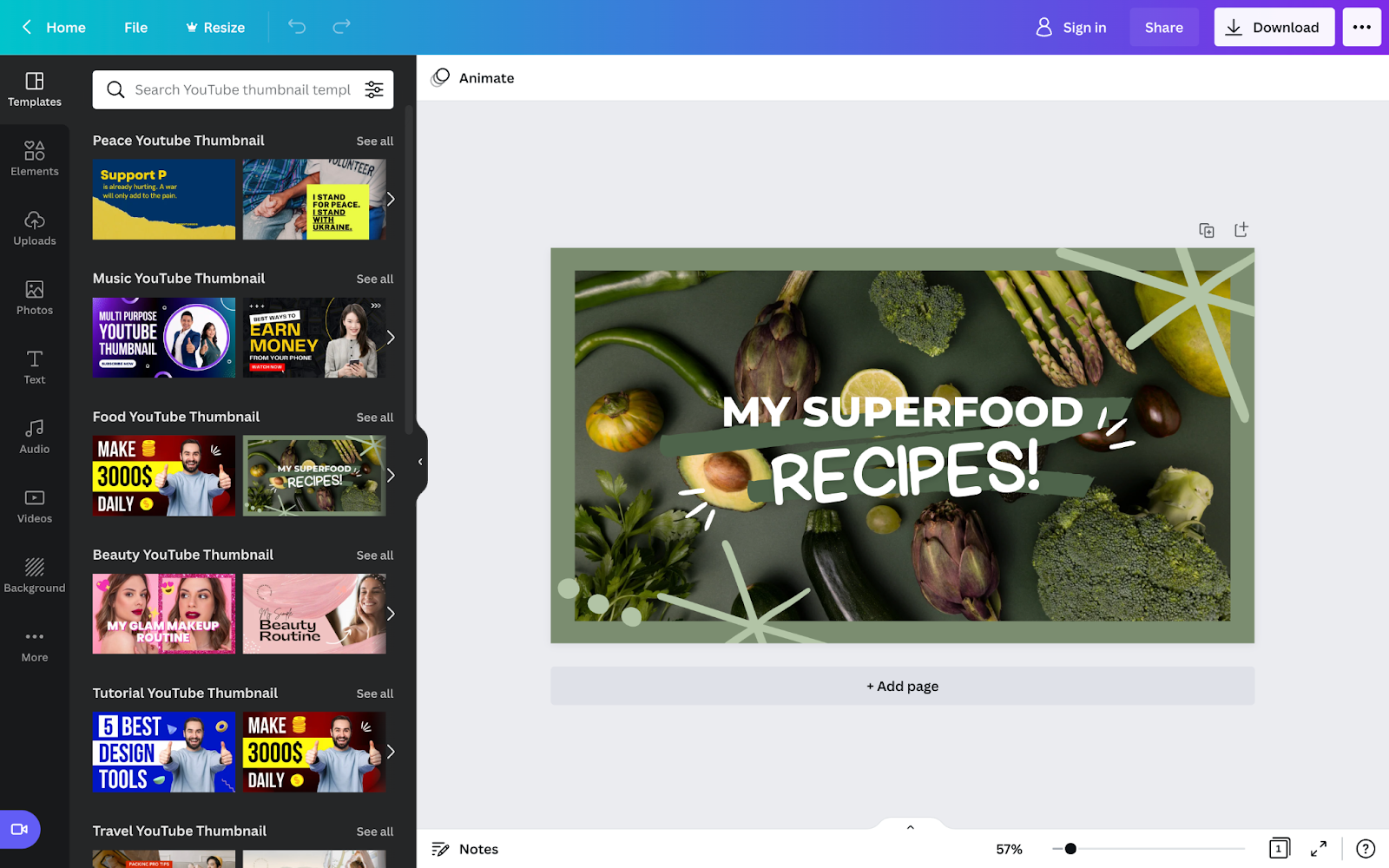
Canva lets you both design thumbnails from scratch and offers over 1,000 professionally designed YouTube thumbnail templates.
Thanks to its user-friendly, drag and drop interface, taking either approach is easy. The filters available also make it super simple to search for templates by:
- Style (minimalist, simple, modern, elegant, etc.)
- Theme (tutorial, business, food etc.) and
- Price (pro and free)
Working with your team? Collaborate on the design in Canva for free.
Pricing:
- Free (sign-in required)
- Pro $12.99 per month (for 1-5 people)
- Enterprise: $30 per month per member
2. Adobe Creative Cloud Express (formally Adobe Spark)
Best for: People familiar with or using the Adobe family software.
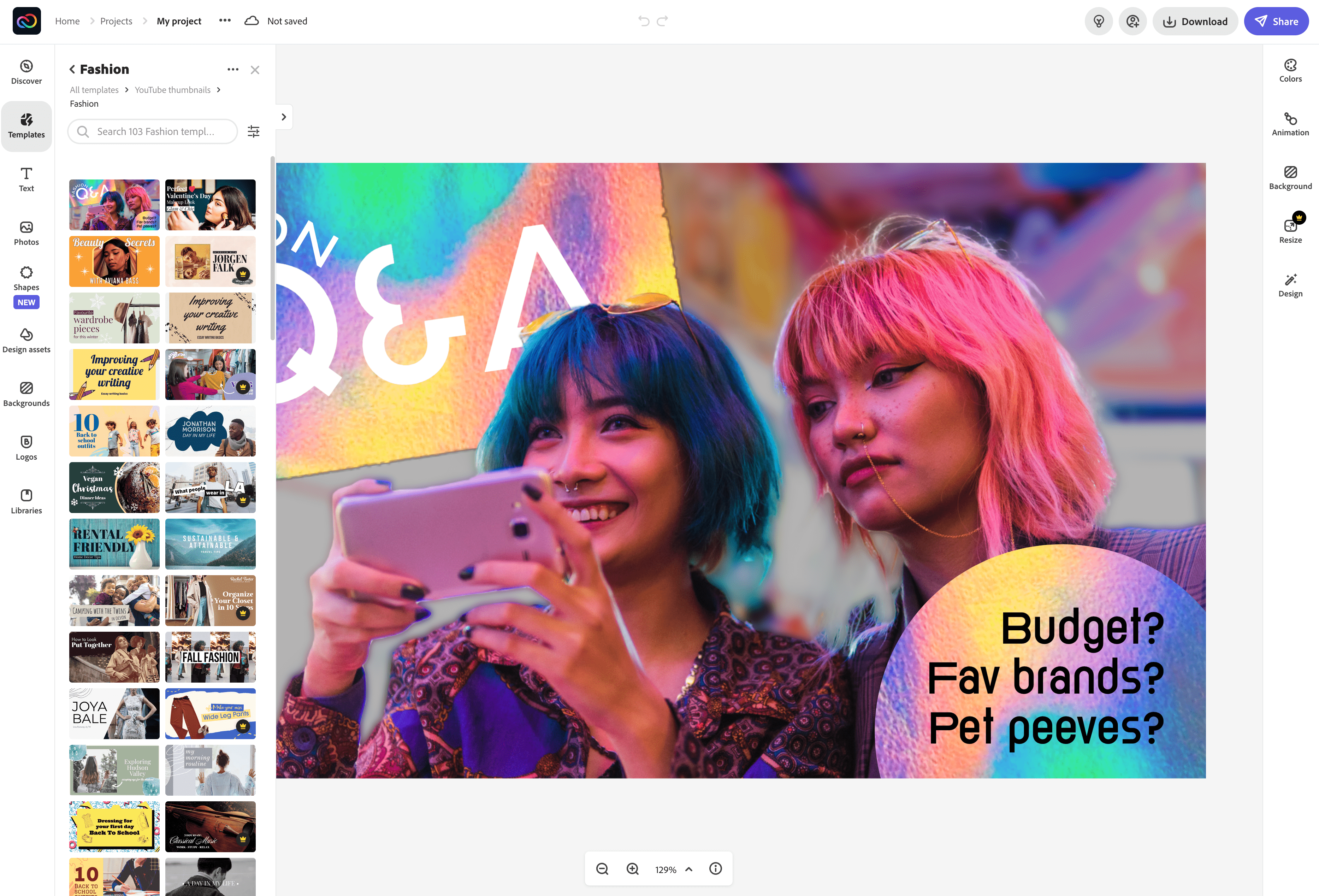
As with Canva, you can use Adobe Creative Cloud Express to create YouTube thumbnails from the blank canvas or use templates.
Adobe also offers royalty-free photos from the Adobe Stock collection. These are, however, limited in number in the freemium version. Speaking of which, you can avail all basic editing features in the free model including removing a picture’s background.
The team collaboration feature isn’t free though. There’s a mobile app available too, letting you design thumbnails on the go.
That said, folks familiar with using the Adobe ecosystem will be the most comfortable using this tool. If you’re among them, there’s another upside for you as well: you can access other Adobe tools from the suite. For example, edit an image in Adobe Illustrator or Photoshop, then include it in your YT thumbnail design using Creative Cloud Express.
Pricing:
- Free
- $9.99 per month with free 30-day trial available
3. PlaceIt by Envato
Best for: Marketers looking for a refined template marketplace to DIY YouTube thumbnail design.

Creating YouTube thumbnails with PlaceIt is as easy as customizing a template online and downloading it.
Since PlaceIt is a subscription service though, you can’t download your design for use without first paying for the subscription that offers unlimited downloads.
Each design download costs $2.95, which isn’t scalable if you’re making YouTube thumbnail designs regularly. In that case, it makes sense to pay for the subscription.
If you’re working on a one-off design though, $2.95 is an affordable option than hiring a dedicated designer to make it.
Pricing:
- $14.95 per month or $89.69 per year
How to Upload a YouTube Thumbnail
You can add from both your desktop or mobile device. Here’s how.
How to Upload a Custom Thumbnail on Desktop
Heads-up: You can only add a custom thumbnail if you’ve a verified YouTube account.
On to the steps now:
1. Sign in to your YouTube Studio account
2. From the menu on the left, choose Videos
3. Select a video from your gallery by clicking on it
4. Under thumbnail, select the Upload Thumbnail option and upload your image
5. Click Save from the top right corner
How to Upload a YouTube Thumbnail on Mobile
Working from your mobile device? Follow these steps:
1. Head to your YouTube Studio app
2. Click on the menu bar from top left and select Videos from here
3. Select the video you want to edit
4. Click Edit (pen icon) and then choose Edit thumbnail
5. Click on Custom thumbnail and upload your thumbnail from your device
6. Confirm your choice and hit Select and then Save
YouTube Thumbnail Best Practices from 3 Experts
Ready for proven tips for creating clicks-generating thumbnails from the folks who are down in the trenches? Let’s go.
1. Reverse engineer what viewers are looking for in a video
The idea is simple: identify what viewers are looking for in a video, then capture it in your YouTube thumbnail.
The thing is: “There are a lot of ways to get someone’s attention,” Ben Toalson who runs Podia’s YouTube channel points out.
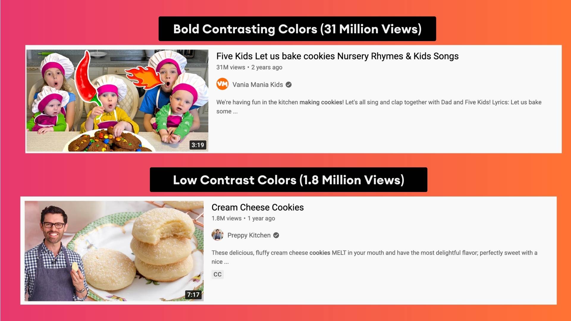
“Our eyes are naturally drawn to bright, contrasting colors, beautiful images, emotive faces, bold text, etc. But a viewer will only click if they’re convinced a video will most likely satisfy what they are looking for at that moment, like the answer to a question, or a laugh, or inspiration.”
Your job then is to “reverse-engineer what a viewer is looking [so you can tell what] would lead them to your content. Then, make your thumbnail all about that.”
So how do you go about identifying what viewers are looking for in a video? Two ways...
#1 study ranking videos
That is: “look for what the competition is doing,” advises Alec Wilcock, VEED’s Video Team Lead. “This helps because first of all you can see what your ‘competition’ is doing and, second, it’s a great way to find inspiration.”
You can also tell what possible elements in the YouTube thumbnails are getting them to rank for the target keyword.
#2 think like your audience
Sam Oh who manages Ahref’s YouTube channel and video marketing shares you ask yourself the following questions to guide your thinking:
- “Who wants to watch this video?
- What would make you insta-click on that video?
- Do you have similar videos on your channel that have produced high CTRs?
- Can I apply any principles from those videos to the video I’m about to publish?”
2. Clearly communicate expectations with your thumbnail
The best YouTube thumbnails are ones that meet expectations — signaling viewers the video is packed with exactly what they’re looking for.
In Sam’s words: “If the expectations you set resonate with your target audience, then you have yourself a click.”
So how do you set expectations with your YouTube video thumbnail? You look at the type of video you’re creating and what the audience expects from it (this goes back to the point above).
“For example, with how-tos, you can show the end result. This communicates that ‘you can achieve [this] if you watch my video.’ For entertainment videos, your thumbnail can communicate, ‘you’re about to see [this] crazy thing.’”
VEED’s Alec also talks about this. “People should be able to understand your video’s goal just from the thumbnail.”
For this: “lean on adding proven, expectations-setting design elements in your video thumbnail. “There are elements that help your video’s thumbnail stand out such as a big red arrow, a big face on the video, bright colors, etc,” explains Alec.
The key here, however, is to “know how to use the elements together to create a clear message and strip away anything from the thumbnail that doesn’t need to be there.”
3. Make sure the video thumbnail and title complement each other
Going deeper into communicating expectations clearly, Sam says, “The thumbnail is usually what catches someone’s attention and the title will be a confirming factor whether they want to watch the video or not.”
It’s why “you want to make your thumbnail simple, easy to digest and [one that] complements your title.”
Explaining this using an example video from their vault, Sam shares their video on How to Speed Up Your WordPress Website. “Our clickthrough rate in the first 24 hours for this video was ~77% higher than a ‘typical’ video on our channel.”
So what worked with the thumbnail design? “The thumbnail is simple in the sense that it’s a before and after picture of a slow person and a person who moves at the speed of light.”
The point that’s worth noting, however, is that “the ‘speed graphs’ bring instant recognition to the topic of website speed [that is, it clearly communicates the key point], so it complements our title,” in Sam’s words.
To achieve this, it's essential to maintain high WordPress site performance by optimizing images, leveraging browser caching, and using a reliable hosting provider.
4. Make sure all the important elements on the thumbnail are easy to read
Another key tip is to ensure your thumbnail design is readable. “An often-overlooked step in designing a thumbnail is previewing how it will actually look in the YouTube feed,” Ben notes.
“Thumbnails are presented at various sizes throughout the platform and are overlaid with the video length and sometimes other information depending on where they appear,” explains Ben.
So “you want to make sure the important elements of the video are easy to make out at any size.”
5. Keep testing
“Because there is so much that goes into a single thumbnail, it’s hard to know exactly what makes it work and what doesn’t,” admits Alec.
It’s why he recommends you “constantly be trying, improving, adjusting, and adapting.”
Podia’s Ben agrees. “Don't be afraid to A/B test your thumbnails. You can use a tool like TubeBuddy that will do it automatically for you. You can even share a few variations with your audience on another platform and ask them which they’d be more likely to click on.”
“Ultimately, the best strategy is to pay attention to what your YouTube audience responds to by testing out different thumbnail designs and identifying patterns over time,” Ben observes.
So remember: “It’s all about trial and error. Just because your current thumbnails are working better than your previous ones, doesn’t mean they couldn’t be even better,” in Alec’s words.
In short, here’s your YouTube thumbnail design checklist from the pros:
✅ Reverse engineer what a viewer is looking for in a video
✅ Clearly communicate expectations with your YouTube thumbnail
✅ Make sure your overall message with the thumbnail is clear
✅ Ensure your thumbnail complements the video’s title
✅ Make all the important elements in the thumbnail easy to read
✅ A/B test to understand what makes winning YouTube thumbnails
YouTube Thumbnail Design: Top 3 Mistakes to Avoid
No design advice is complete without a list of mistakes to keep away from. So we prodded the experts we talked to about the mistakes they made and the subsequent lessons they learned.
Here’s what they shared — plus what to do instead:
- Don’t add the video title in the thumbnail
“I used to think you needed to put your actual video title in the thumbnail if you wanted to rank well,” confesses Ben.
Over time, however, Ben shares he’s learned a key lesson “when it comes to thumbnails, less is more.”
“People value simplicity when it comes to making quick decisions,” he explains. “Using fewer words and/or using clear imagery takes the friction away from your viewers decision of whether or not to click on your video.”
So instead of adding a 7-9-word title, Ben has learned that 3 or 4 words in the thumbnail perform better.
✅ Less is more. Meaning: fewer words and clear imagery with no overdo of design elements.
2. You don’t need crazy expressions for every other video thumbnail
“I tried to create thumbnails with crazy expressions without purpose or relevance to the topic,” Sam admits.
“Since everyone else had these 😲-like thumbnails, I thought it might ‘capture’ the audience’s attention. I was wrong.”
To avoid this kind of mistake, Sam says it’s important you look at what the video is about.
“For example, if your topic is ‘how to tie a tie,’ and you’re doing this (😱), what exactly is so crazy that’s worth screaming about? Nothing. A person who would click on this video wants to learn – not scream in shock.”
✅ Make sure your YouTube thumbnails are relevant to the video content you’re sharing.
3. You can’t stick with one thumbnail strategy for all your videos
“A mistake I’ve made in the past is thinking that every thumbnail strategy can be used on every video,” shares Alec.
“For example, a popular strategy to get viewers to click on your video is to create a curiosity gap within the thumbnail. However, when making a tutorial focused on a ‘how to’ keyword, we’ve found that showing a clear message within the thumbnails works better.”
✅ There’s no one-size-fits-all YouTube video thumbnail design strategy. So review your video before you work on the thumbnail.
Bonus: Other YouTube Thumbnail Design Don’ts
And finally, keep in mind that YouTube warns your custom thumbnails will be rejected if any of these elements are present in them:
- Violence
- Hate Speech
- Harmful or dangerous content
- Nudity or sexually provocative content
When designing thumbnails, you’ll also want to think in terms of your YouTube channel’s overall look. This means your thumbnails shouldn’t clash with one another. Instead, use them to create a uniform look for the channel.
It’s also important your custom thumbnails don’t use YouTube’s theme colors — red, black, and white to prevent your videos from blending in with the platform’s colors.
To recap, a custom YouTube thumbnail is a great way to increase your video views.
Be sure to stick with the correct YouTube thumbnail size and stay on brand when designing thumbnail images though. And don't forget to identify what works by reviewing thumbnails of videos ranking on the topic.
Haven’t recorded your YouTube video yet? Here are 105 YouTube video ideas to inspire you.


